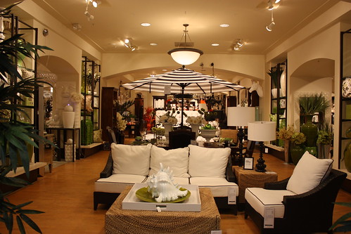
Have you ever been to Z Gallerie before? If not, I'm going to take you on a little tour and it will be a treat. I must warn you though that you must be able to filter when you look at these pictures. I always have to remember to filter when I walk thru the store.
Z Gallerie is set up like a showroom and retail space all wrapped in one. Around each display you will see available items and in each room or section of the store there will be several displays.
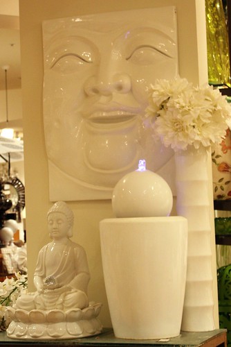
You just have to learn to take in each little section piece by piece. It's not as overwhelming as the pictures appear.
I love it. I walk thru and just feel the inspiration soaking in. I want things that would never fit into my normal style just because everything seems so set the perfect backdrop for the living space you never knew you wanted.
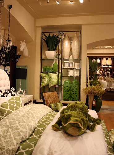
Z Gallerie has a certain knack for making unexpected and often downright odd things look like they belong. For instance, who would expect a stuffed alligator to be an accent for a bed?
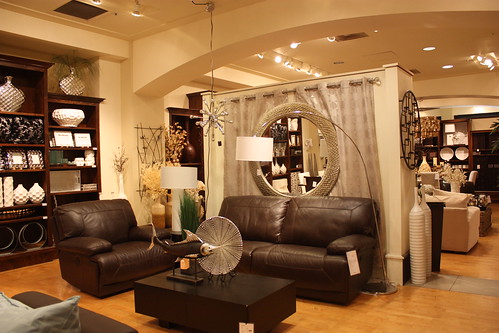
I wandered today just trying to figure out what it is that I love so much about this place. What exactly is the Z Gallerie style?
I'm not sure I have answers but I have picked out some common threads.
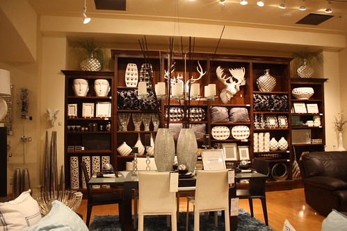
White solid ceramics, lots of sparkle and bling, both very dark and very light solid paterned furniture and pops of the chosen accent color. They love texture and the stacking and layering of objects in a space.
Z Gallerie mixes modern, traditional, quirky, odd, vintage, overstated and understated pieces with what appears to be very little effort.
Did anyone notice the white ceramic moose head in the background? They also have horses and deer if you'd like to stick with the theme. :)
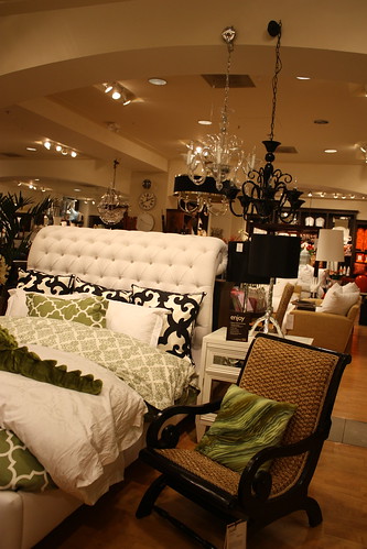
I think the layering of the different chandeliers and lamps within the space is just perfection. You know how I love for things to mesh well without the symmetrical matching look.
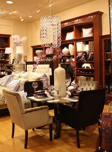
I love the plush chairs here that really offset the sleek glass table.
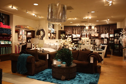
The rich, deep colors in this sitting area are lovely. This picture shows you what I mean about the displays.
From here you can see a sitting area or living room, bedroom and dining area. Somehow they all blend and flow.
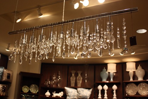
I adore this modern take on a chandelier. Love it. Want it. Need it. Have no where to put it. I love the various crystals and the dreamy, wintery look. Of course, if you saw my wedding this won't surprise you.
Z Gallerie loves chandeliers and you can find anything from this one to a ship made out of crystals. Yes, I said a ship... like a pirates ship.
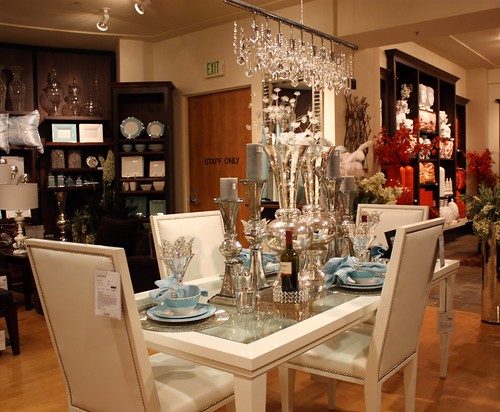
I was immediately drawn to this table which makes me laugh because if I take it piece by piece its really not my style. I always seem to forget this in Z Gallerie.
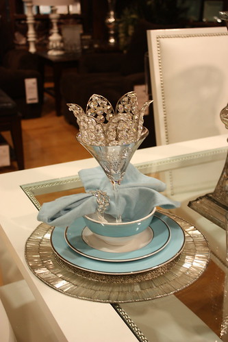
Tell me it wouldn't be fun to dine at this table though.

This is a fun mesh of glammed up ocean motif. The beach which generally makes me think of very relaxed decor takes on a new look.
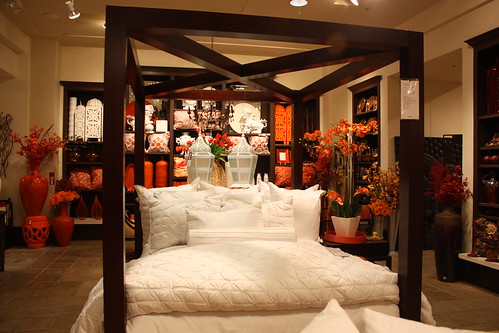
This is just a great look at the impact of different texture. I also love that although it seems the design world is going more towards white that there is plenty of color out there still. All those orange accents in the back just waiting to get picked up.
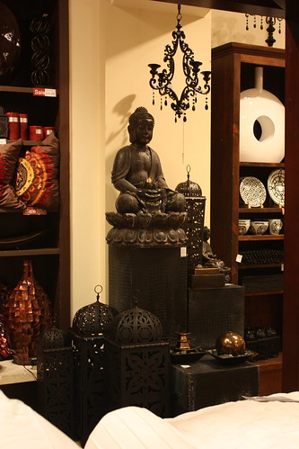
I see this little meditation area on a bedroom wall, a nook in a living space or in an outdoor atrium. Their signature layering of objects and textures and the saturation of a color shines thru.
They also have an entire area dedicated to framed and ready to hang art work. I have my eye on this piece which would be perfect in the space above my bed, as well as a whole host of birch/aspen pictures that I would love to have in our place.
Even if Z Gallerie isn't your style it's packed with conversation pieces and inspiration to change things up a bit.
What stores do you love to look thru?


I love Z Gallerie---one of my favorite places for home decor--
ReplyDeleteI love the bedding in the picture with the stuffed alligator. The gator notsomuch, but you know, creativity counts! ;)
ReplyDeleteThe bed with the bold bright bedding definitely caught my eye. Snazzy.
ReplyDeleteI'm drawn to soft colorful feminine stuff. I love anything Anthropologie home furnishings. Pottery Barn is always good. I just need a money barrel when I go in those stores:) So I usually find stuff at TJ Maxx.
When I saw the title I knew I was in trouble---it's like walking through an eye-candy store!! So much fun stuff to contemplate!
ReplyDeleteThis store seems like it screams you girl, does it? I see you as more modern and contemporary with a splash of vintage a punch of color, I could totally be wrong, but anyhoo, thanks for the tour! I love looking through anthro and pottery barn, can't buy anything but love looking!
ReplyDeleteI LOOOVE that stuffed alligator! I've been reading your posts but unable to comment from work, BTW... I'm a lurker by accident! :)
ReplyDeleteThat looks like a really FUN place girl!
ReplyDeleteI looooove Z Gallerie. I took my husband there and he contently browsed for almost an hour. A miracle!
ReplyDeleteI've never heard of Z Gallerie but it's beautiful. I'd love to have dinner at that white and blue table. I'd feel like I was having dinner with the Snow Queen or something. Gorgeous!
ReplyDeleteI love looking around a place in our area called Scandinavian Design. It's just a simple furniture store but it's fun.
I was actually at Z Gallerie here in Utah last week and I bought a cute little chest to use as a coffee table in my living room! It's one of my favorite places to go for gifts because I can almost always find some cute little doodad or other for my friends and family...
ReplyDeleteLoved the tour! Thanks!!
ReplyDeletefunny thing, I stumbled across your page on google images of zgallerie. I look to indulge, and daydream @ the unique layouts zgallerie has. As a designer myself, its inspirational just to see what they do! Also I love how you've described each picture on your page, it's as if you took the words out of my mouth lol....Yvonne B. from Cincy
ReplyDelete