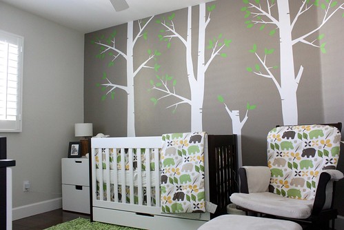
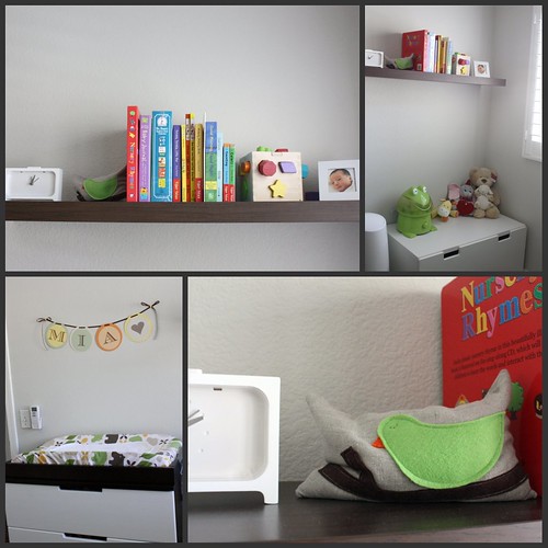
I'm totally in love with baby Mia's nursery. I love the modern style.
I love that it's for a little girl and it's not pink.

Can she be any more adorable? Remember Mia's mom Joanne?
Joanne had a brunch at her house and there were 4 little cuties there... but I'll show you that tomorrow.
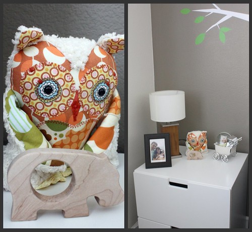
I have a thing for owls and this one is awesome.
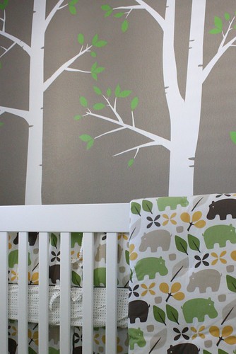
The colors are fresh and clean, the patterns are super cute.
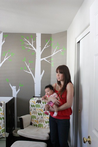
I've also had my eye on those decals forever, you know how I love birch.
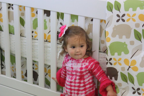
Speaking of super cute... meet Samantha!
Her room is so neat and organized and clutter free I feel like cleaning mine now.
The thing about modern rooms is that you need to be able to edit out extras.
I'm horrible at editing. I want to include everything which is why I have a gazillion pictures in a post. Luckily I've learned to go to picnik to make collages.
The fact is that their entire house has the same clean, modern feel. Like being in a spa.
Maybe instead of cleaning and organizing I'll see if I can move in with Joanne and her husband. I'm sure he won't mind.
*I almost forgot to mention that the chair cover was made from some drapes that Joanne bought! She didn't want to use the drapes as drapes but wanted to incorporate the material. I think that's genius and a great way to personalize and make stylish a simple glider.

How pretty!!! ,,,and how cute are they!!! luvuallbye
ReplyDeleteI just forwarded this link to my sis in law... how CUTE!!!
ReplyDeleteSo, I'm thinking someone (who shall remain nameless) is kind of thinking she might want a little sister for Peanut.....hmmm...
ReplyDeleteSO cute!! I'm loving trees in nurseries and THIS one is adorable. (Plus, the name Mia is fabulous enough for any girl as adorable as this! My own Mia would approve of her cuteness :)
ReplyDeleteWhat is the froggy thing on the self in the collage pic? I need one asap for my girlfriends froggy style baby shower this Saturday.
ReplyDeleteThis nursery looks like something from a baby furnature catalog, its so unique.