Did I mention I'm not the normal bride? I'm sort of a pain when it comes down to it. I spend a lot of time trying to explain my wedding thought process.
I want "wintery" but not "Christmasy". I want things to be cohesive but not to match. I want centerpieces with very little if any flowers. No roses, no lace, no ruffles, no wedding bells, no doves, no hearts.
Its not that I don't like those things... because I think they are wonderful. I love flowers, I do. I love weddings dripping with romance. I love the traditional wedding stuff when I go to weddings. Its just that I wanted something different.
I'll post about the bridesmaid dresses and groomsmen ties soon. The concept of not matching seems to be a sore spot for so many people. ~sigh~

So the inspiration point for this started with bare branches and candlelight like this and this. From there it grew and grew.
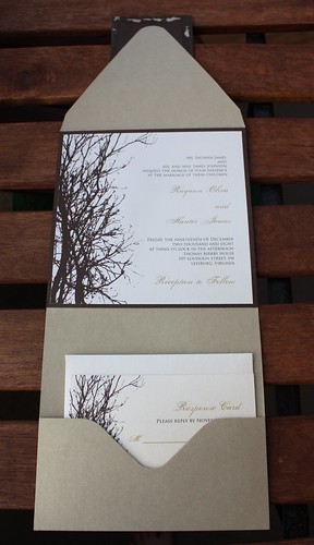
Dad really liked the idea of a pocket fold invitation so I used that as a starting point.

I had a really hard time photographing these because the paper has a sort of metallic sheen to it. The colors didn't really come out right. The sun was setting and the light was disapearing.

But it sure was pretty out!
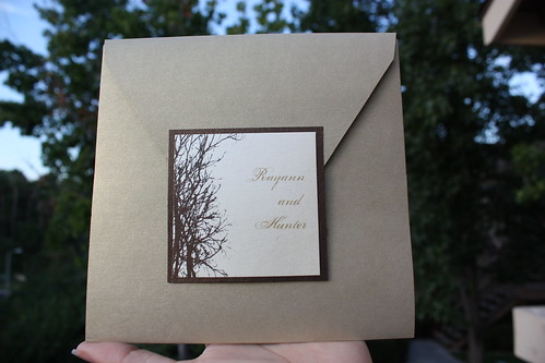
The first 2 pictures are from the outside of the pocket fold.

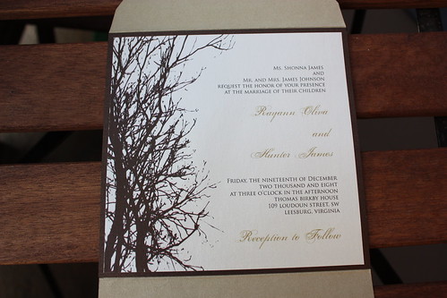
The color of the outer envelope is called Gold Leaf, the chocolate brown backing is called Bronze and the paper itself is Champagne. I can't even remember what color combo this originally was but it was awesome that she sent us the set in our colors.
I changed the font of the names to something a little bolder and slightly more simplistic... and I made it blue for some pop.

The bottom pocket holds the response card and will also include the reception card. They even cut them so that they will stagger like I show in the picture. Fancy!

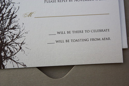
We actually changed the wording on the responses and included a place to list how many in the party. There was some discussion as to whether or not guests would understand what this meant. Is "toasting from afar" confusing?

One more thing... this was a sample and our names are not Rayann and Hunter.
Are you still awake?

Wow! I love your invites! And I'm right there with you on not wanting flowers & hearts, blah blah blah. I too have a fond appreciation for those things, but don't want it to be "my wedding". We are getting married in May next year (Memorial Day weekend). I'm very curious to know more about the dresses & ties. :-)
ReplyDeleteAlso, you did a fabulous job on the invites. I am very impressed!!
Oh, SO pretty. Love me some wedding stuff! Toasting from afar, not confussing, but I work in the industry, so my opinion might not be the one you want. So glad to see a wedding post and can't wait for more details!
ReplyDeleteGORGEOUS! And I think it's fun that you're going with something a little different. I know everyone thinks winter weddings need to be Christmasy... but why?
ReplyDeleteDifferent is good. I can't picture you doing things the traditional way anyway! :)
ReplyDeleteOooh, I like! They are very wintery without being Christmasy. Very very classy. I'm in a wedding the week before Christmas and it is going to be Christmasy, so I say kudos for going against the grain. Meanwhile, just cross your fingers that I don't have to wear jewelry that looks like Christmas ornaments....
ReplyDelete"...this is a sample..."
ReplyDeleteI suppose this means you're not getting married in Leesburg, Virginia, either. I wondered about that. LOL
LOVE the invites. And it is good that those aren't your actual invites because...you would be a year late.
ReplyDeleteLove these invites. I always wish I had done something more like this for my wedding. Mine were super plainJust visiting OC blogs to let locals know about our giveaway for a free family photo shoot http://elislids.blogspot.com/2009/09/5-monkey-moon-photo-session.html
ReplyDeleteOoh! I love them! So simple and modern :)
ReplyDeleteI love, love, love them!! And girl, it is YOUR wedding--do it your way!! I say you have impeccable taste!
ReplyDeleteThose are just gorgeous. Are you getting married soon? I think I haven't been reading your blog long enough to know that, so I feel stupid if I should know that...
ReplyDeleteHello there. Thanks for your comment on my dad tribute. I love my dad. And mom.
ReplyDeleteI'm thinking this might be my first visit to your blog. These wedding invitations are classy. I love it. I could never brain something out the way you have here regarding what you want for your wedding. All I remember wanting was my husband. hee hee- got him.
I love the cohesive, but not matching. If I could do it over, that's exactly what I'd do right there. It's a perfect idea. Be yourself.
Congrats that you are getting married. I got married in the winter. Brrr. Didn't really plan it, it just fell in as such.
I see you know Mrs. E. I love Mrs. E. She's one of my very faves. I only know her from the blogs.
Take care my dear and visit again sometime.
Heidi @2 Thinks to Share
Well guess what, this is not my first time over here because I am your follower. Duh. I don't know why it felt unfamiliar. Guess I need to get over here more!
ReplyDeleteI LOVE those invitations!
ReplyDeleteThey look like you! No ... I mean they look like what I think your style is ... Classy yet understated. Sophisticated yet subtle.
I LOVE them! I know ... I already said that ... but I do!
I'm so glad you all liked the invites! Thank you for all the compliments.. its not that I need validation... I just need validation, is all. :P
ReplyDeleteAnd no, I'm not a year late or in the wrong state :)
Welcome back 2thinks!
Love'em! No, I don't think the response cards are confusing, I think the wording is warm whereas the traditional wording tends to be cold and impersonal.
ReplyDelete~Andrea~
So, so very beautiful. Classy and artistic and just plain gorgeous, all at once. I really love "toasting from afar" too.
ReplyDeleteLove, love love these! I love the idea! One of the things I love about weddings NOW (as opposed to when I was married) is that they are SO MUCH MORE PERSONAL (sorry for the shouting!). They reflect the couple better and I think that's a great thing~
ReplyDeleteLOL, yes, I'm awake. I like the look you're going for.
ReplyDelete~ingrid
Okay, LOVE them. Can't wait to see more stuff!!!!!
ReplyDeleteCan I call you Rayann from now on? Classy! How did i miss this post? They're lovely! Our anniversary is coming up so I may post pics of our invite - our faces were on it and it showed how weirdly big Dave's head is and how stupidly puny mine is! Your invites look beautiful and I am a sucker for nice folding and tricks like the rsvp cards. When are you sending them all out?!
ReplyDeleteThose are great! When I got married 16 years ago everyone was still doing the plain ole black and white invites. So cool. Good decision making girl! Im sure it's gonna be beautiful.
ReplyDeleteThose are truly lovely, and I think the branches are perfect and lovely, Rayann! Or are you Hunter? :)
ReplyDelete